https://github.com/sta-112-f22/lab-01-r-you-ready.gitLab 01 - R you ready?
Due: 2022-08-31 at noon Turn your .html file in on Canvas
Introduction
![]()
R is the name of the programming language itself and RStudio is a convenient interface.
The main goal of this lab is to introduce you to R and RStudio, which we will be using throughout the course both to learn the statistical concepts discussed in the course and to analyze real data and come to informed conclusions.
As the labs progress, you are encouraged to explore beyond what the labs dictate; a willingness to experiment will make you a much better programmer. Before we get to that stage, however, you need to build some basic fluency in R. Today we begin with the fundamental building blocks of R and RStudio: the interface, reading in data, and basic commands.
Getting started
Each of your assignments will begin with the following steps.
- Find the lab instructions under the course syllabus on our website bit.ly/sta-112-f22
- Go to our RStudio Pro workspace and create a new project using my template.
For this assignment, go to RStudio Pro and click:
Step 1. File > New Project
Step 2. “Version Control”
Step 3. Git
Step 4. Copy the following into the “Repository URL”:
Packages
In this lab we will work with two packages: datasauRus which contains the dataset, and tidyverse which is a collection of packages for doing data analysis in a “tidy” way. These packages have already been installed on your RStudio Pro workspace.
If you’d like to run your code in the Console as well you’ll also need to load the packages there. To do so, run the following in the console.
library(tidyverse)
library(datasauRus)
Note that the packages are also loaded with the same commands in your Quarto (.qmd) document.
Warm up
Before we introduce the data, let’s warm up with some simple exercises.
The top portion of your Quarto file (between the three dashed lines) is called YAML. It stands for “YAML Ain’t Markup Language”. It is a human friendly data serialization standard for all programming languages. All you need to know is that this area is called the YAML (we will refer to it as such) and that it contains meta information about your document.
YAML:
Open the Quarto (qmd) file in your project, change the author name to your name, and render the document.
Change the date in your YAML to today’s date, and render the document.
Packages
In this lab we will use the tidyverse and datasauRus packages. We can load them using the following:
library(tidyverse)
library(datasauRus)
Data
If it’s confusing that the data frame is called datasaurus_dozen when it contains 13 datasets, you’re not alone! Have you heard of a baker’s dozen?
The data frame we will be working with today is called datasaurus_dozen and it’s in the datasauRus package. Actually, this single data frame contains 13 datasets, designed to show us why data visualization is important and how summary statistics alone can be misleading. The different datasets are marked by the dataset variable.
To find out more about the dataset, type the following in your Console: ?datasaurus_dozen. A question mark before the name of an object will always bring up its help file. This command must be run in the Console.
- Based on the help file, how many rows and how many columns does the
datasaurus_dozenfile have? What are the variables included in the data frame? Add your responses to your lab report.
Let’s take a look at what these datasets are. To do so we can make a frequency table of the dataset variable:
datasaurus_dozen %>%
  count(dataset)
# A tibble: 13 × 2
dataset n
<chr> <int>
1 away 142
2 bullseye 142
3 circle 142
4 dino 142
5 dots 142
6 h_lines 142
7 high_lines 142
8 slant_down 142
9 slant_up 142
10 star 142
11 v_lines 142
12 wide_lines 142
13 x_shape 142Matejka, Justin, and George Fitzmaurice. “Same stats, different graphs: Generating datasets with varied appearance and identical statistics through simulated annealing.” Proceedings of the 2017 CHI Conference on Human Factors in Computing Systems. ACM, 2017.
The original Datasaurus (dino) was created by Alberto Cairo in this great blog post. The other Dozen were generated using simulated annealing and the process is described in the paper Same Stats, Different Graphs: Generating Datasets with Varied Appearance and Identical Statistics through Simulated Annealing by Justin Matejka and George Fitzmaurice. In the paper, the authors simulate a variety of datasets that the same summary statistics to the Datasaurus but have very different distributions.
Data visualization and summary
- Plot
yvs.xfor thedinodataset. Then, calculate the correlation coefficient betweenxandyfor this dataset.
Below is the code you will need to complete this exercise. Basically, the answer is already given, but you need to include relevant bits in your qmd document and successfully render it and view the results.
Start with the datasaurus_dozen and pipe it into the filter function to filter for observations where dataset == "dino". Store the resulting filtered data frame as a new data frame called dino_data.
dino_data <- datasaurus_dozen %>%
  filter(dataset == "dino")
There is a lot going on here, so let’s slow down and unpack it a bit.
First, the pipe operator: %>%, takes what comes before it and sends it as the first argument to what comes after it. So here, we’re saying filter the datasaurus_dozen data frame for observations where dataset == "dino".
Second, the assignment operator: <-, assigns the name dino_data to the filtered data frame.
Next, we need to visualize these data. We will use the ggplot function for this. Its first argument is the data you’re visualizing. Next we define the aesthetic mappings. In other words, the columns of the data that get mapped to certain aesthetic features of the plot, e.g. the x axis will represent the variable called x and the y axis will represent the variable called y. Then, we add another layer to this plot where we define which geometric shapes we want to use to represent each observation in the data. In this case we want these to be points, hence geom_point.
ggplot(data = dino_data, mapping = aes(x = x, y = y)) +
  geom_point()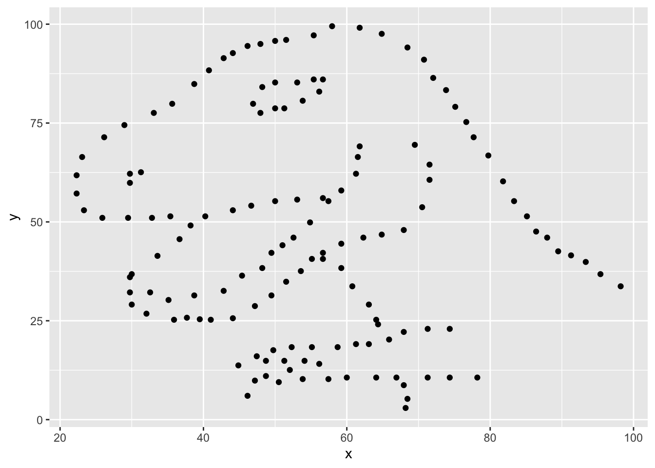
If this seems like a lot, it is. And you will learn about the philosophy of building data visualizations in layers in detail soon. For now, follow along with the code that is provided.
For the second part of this exercises, we need to calculate a summary statistic: the correlation coefficient. Correlation coefficient, often referred to as \(r\) in statistics, measures the linear association between two variables. You will see that some of the pairs of variables we plot do not have a linear relationship between them. This is exactly why we want to visualize first: visualize to assess the form of the relationship, and calculate \(r\) only if relevant. In this case, calculating a correlation coefficient really doesn’t make sense since the relationship between x and y is definitely not linear – it’s dinosaurial!
But, for illustrative purposes, let’s calculate correlation coefficient between x and y.
Start with dino_data and calculate a summary statistic that we will call r as the correlation between x and y.
dino_data %>%
  summarize(r = cor(x, y))
# A tibble: 1 × 1
r
<dbl>
1 -0.0645Plot
yvs.xfor thestardataset. You can (and should) reuse code we introduced above, just replace the dataset name with the desired dataset. Then, calculate the correlation coefficient betweenxandyfor this dataset. How does this value compare to therofdino?Plot
yvs.xfor thecircledataset. You can (and should) reuse code we introduced above, just replace the dataset name with the desired dataset. Then, calculate the correlation coefficient betweenxandyfor this dataset. How does this value compare to therofdino?Finally, let’s look at all datasets at once. In order to plot this we will make use of facetting.
ggplot(datasaurus_dozen, aes(x = x, y = y, color = dataset)) +
  geom_point() +
  facet_wrap(~ dataset, ncol = 3) +
  theme(legend.position = "none")
Facet by the dataset variable, placing the plots in a 3 column grid, and don’t add a legend.
And we can use the group_by function to generate all the summary correlation coefficients.
datasaurus_dozen %>%
  group_by(dataset) %>%
  summarize(r = cor(x, y))
How do the plots compare to each other across all datasets? How do the correlation coefficients compare to each other across all datasets? What can we learn from this?
- Let’s add a “line” to our plots show what the linear fit for these data would be. This line is drawn by fitting a simple linear regression model (in R this is called
lmfor “linear model”) predictingyusingxfor each data set. Notice we added one line to the code we ran for Exercise 5 (geom_smooth) to add this visual layer. Add the code below to your report and examine the plot.
ggplot(datasaurus_dozen, aes(x = x, y = y, color = dataset)) +
  geom_point() +
  geom_smooth(formula = y ~ x, method = "lm") +
  facet_wrap(~ dataset, ncol = 3) +
  theme(legend.position = "none")
Is the linear model a good way to represent these data? Do the lines on the plot accurately explain the relationship between x and y? Why or why not?
Grading
| Total | 100 pts |
|---|---|
| Exercises 1-4 | 60 pts |
| Exercise 5 | 20 pts |
| Exercise 6 | 20 pts |
![]() Lab adapted from datasciencebox.org by Dr. Lucy D’Agostino McGowan
Lab adapted from datasciencebox.org by Dr. Lucy D’Agostino McGowan