Code

How can we visualize the relationship between two continuous variables?
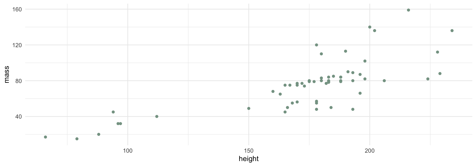
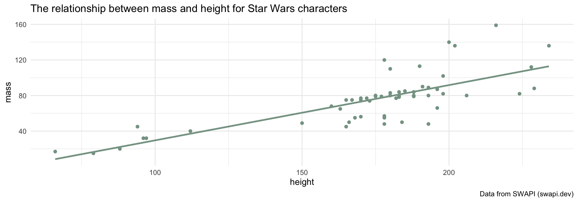
If we know a Star Wars character’s height, can we guess how much they weigh?
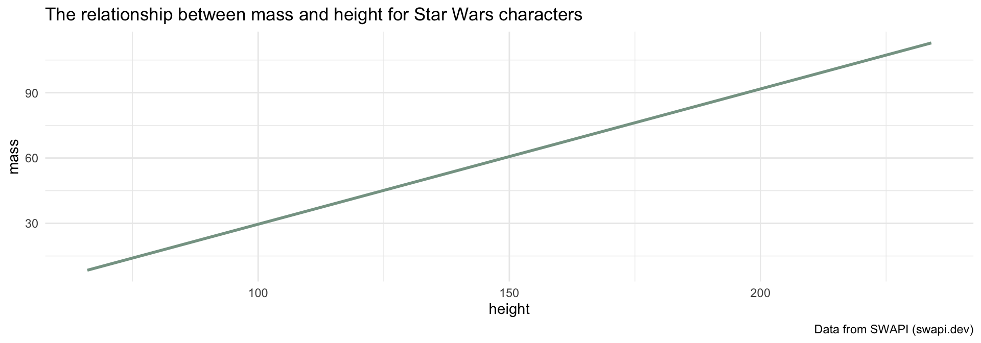
What function do you think we are using to get the mean value of \(y\) with simple linear regression?
What is the equation that represents this line?
\[\Large y = \beta_0 + \beta_1 x\]
\[\Large \textrm{mass} = \beta_0 + \beta_1 \times \textrm{height}\]
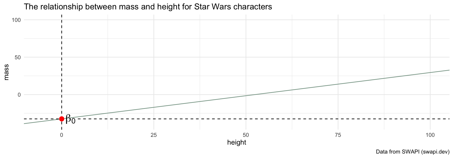
What is \(\beta_0\)?
What is \(\beta_0\)?
library(geomtextpath)
ggplot(starwars_nojabba, aes(height, mass)) +
geom_abline(
intercept = -32.54,
slope = 0.62,
color = "#86a293"
) +
geom_vline(xintercept = 0, lty = 2) +
geom_texthline(
yintercept = -32.54,
lty = 2,
lwd = 6,
label = as.character(expression(beta[0])),
parse = TRUE,
hjust = 0.1
) +
scale_x_continuous(limits = c(-5, 100)) +
scale_y_continuous(limits = c(-40, 100)) +
geom_point(aes(y = -32.54, x = 0), color = "red", size = 3) +
labs(title = "The relationship between mass and height for Star Wars characters",
caption = "Data from SWAPI (swapi.dev)")Is this meaningful in this dataset?
ggplot(starwars_nojabba, aes(height, mass)) +
geom_abline(
intercept = -32.54,
slope = 0.62,
color = "#86a293"
) +
geom_vline(xintercept = 0, lty = 2) +
geom_texthline(
yintercept = -32.54,
lty = 2,
lwd = 6,
label = as.character(expression(beta[0])),
parse = TRUE,
hjust = 0.1
) +
scale_x_continuous(limits = c(-5, 100)) +
scale_y_continuous(limits = c(-40, 100)) +
geom_point(aes(y = -32.54, x = 0), color = "red", size = 3) +
labs(title = "The relationship between mass and height for Star Wars characters",
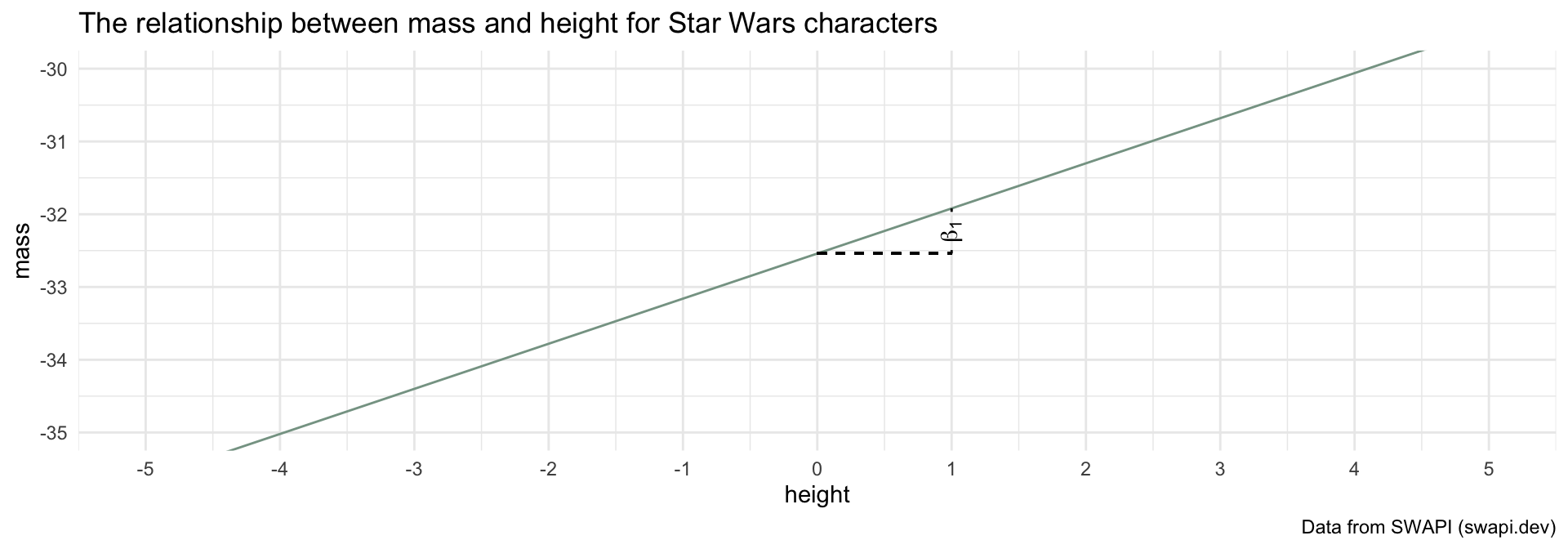
caption = "Data from SWAPI (swapi.dev)")What is \(\beta_1\)?
ggplot(starwars_nojabba, aes(x = height, mass)) +
geom_abline(
intercept = -32.54,
slope = 0.62,
color = "#86a293"
) +
geom_segment(aes(x = 0, xend = 1, y = -32.54, yend = -32.54), lty = 2) +
scale_x_continuous(limits = c(-5, 5), breaks = -5:5) +
scale_y_continuous(limits = c(-35, -30)) +
annotate(
"textsegment",
x = 1,
xend = 1,
y = -32.54,
yend = -32.54 + 0.62,
label = as.character(expression(beta[1])),
parse = TRUE,
angle = 0
) +
labs(title = "The relationship between mass and height for Star Wars characters",
caption = "Data from SWAPI (swapi.dev)")\[y = \beta_0 + \beta_1 x + \color{blue}{\varepsilon}\]
\[y = \beta_0 + \beta_1 x + \color{blue}{\varepsilon}\]
starwars_nojabba <- starwars_nojabba %>%
mutate(fitted = fitted(lm(mass ~ height, data = starwars_nojabba)))
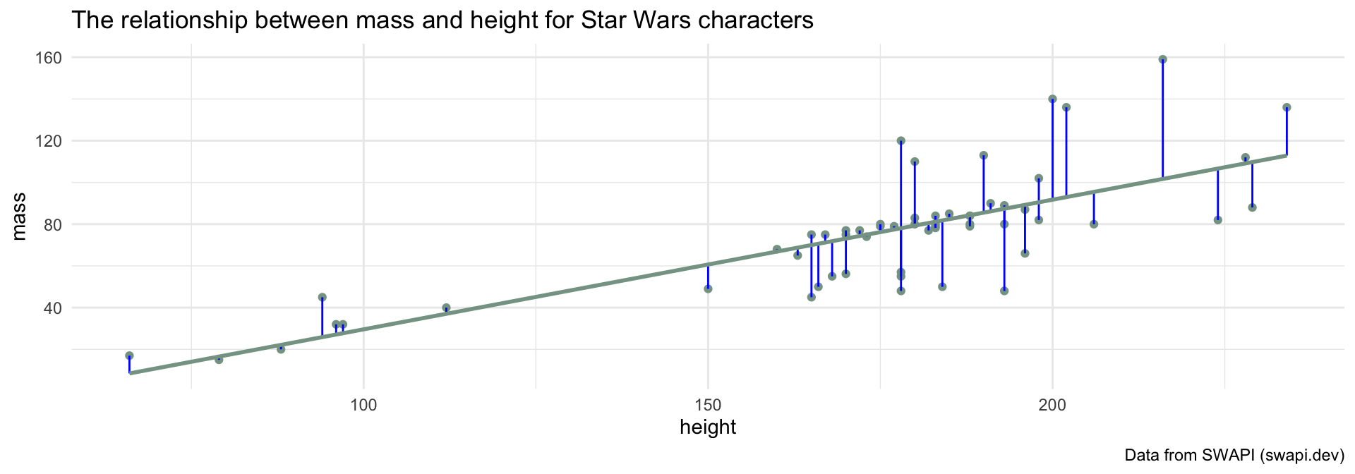
ggplot(starwars_nojabba, aes(x = height, mass)) +
geom_point(color = "#86a293") +
geom_segment(aes(
x = height,
y = mass,
xend = height,
yend = fitted
),
color = "blue") +
geom_smooth(
method = "lm",
se = FALSE,
formula = "y ~ x",
color = "#86a293"
) +
labs(title = "The relationship between mass and height for Star Wars characters",
caption = "Data from SWAPI (swapi.dev)")\[\Large y = \beta_0 + \beta_1 x + \varepsilon\]
\[\Large \hat{y} = \hat{\beta}_0 + \hat{\beta}_1 x\]

height and mass).How can you tell the difference between a parameter that is from the whole population versus an estimate from the sample?
Which lines represent “typical” observations?
Which lines represent “typical” observations?
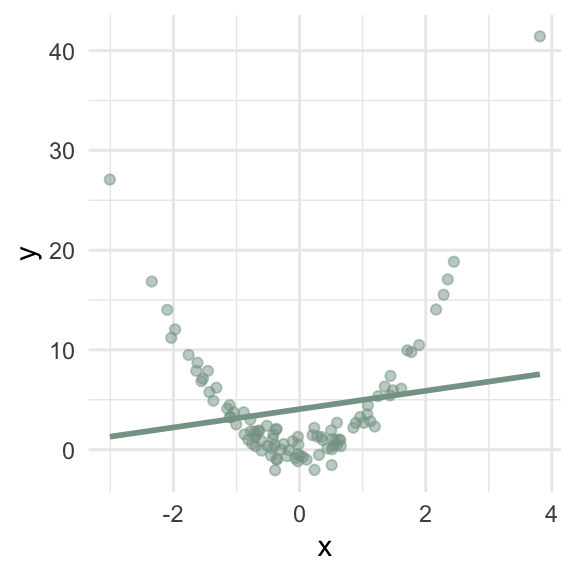
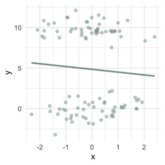
When is a simple linear model an appropriate summary measure to calculate?
What assumptions need to be true in order to use a simple linear model to represent your two continuous variables?