Code
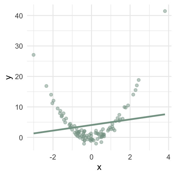
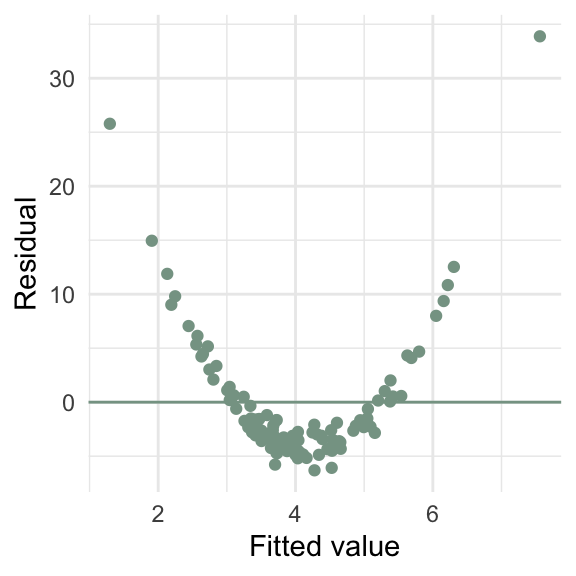
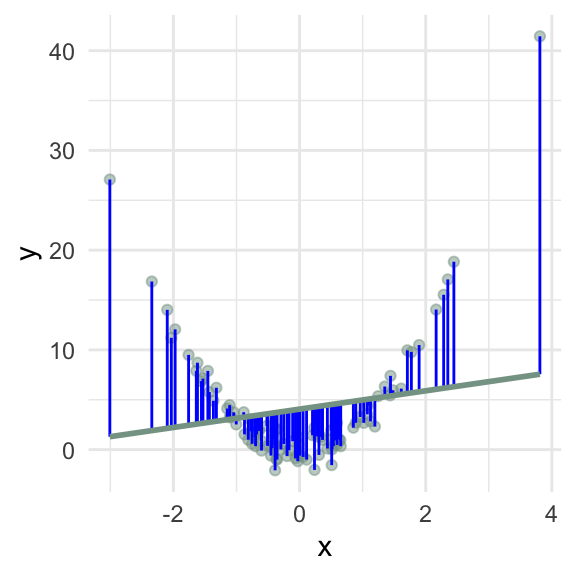
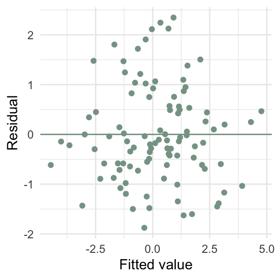
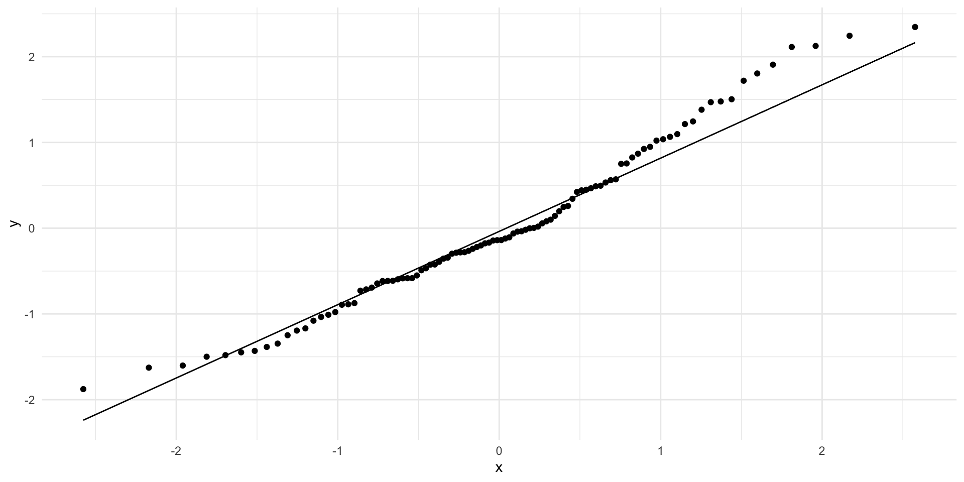
What goes wrong if the relationship between \(x\) and \(y\) isn’t linear?
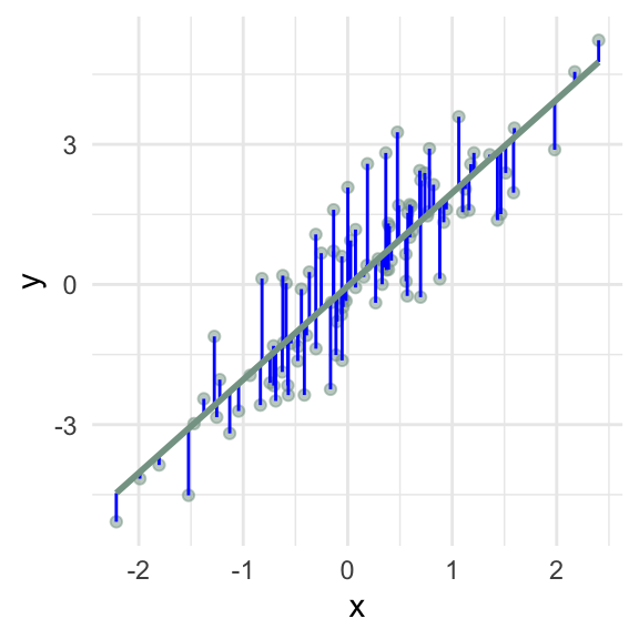
\(\hat\beta_1\) = 2 (95% CI: 1.79, 2.21)
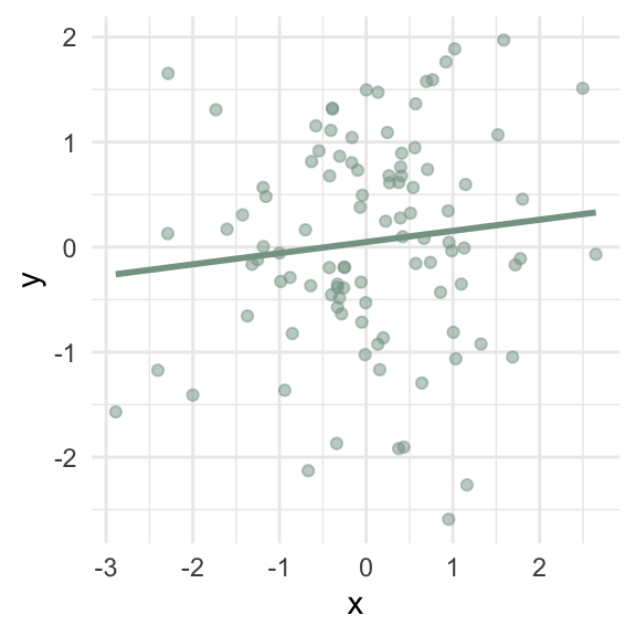
\(\hat\beta_1\) = 0.11 (95% CI: -0.08, 0.3)
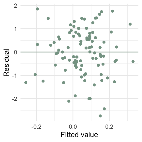
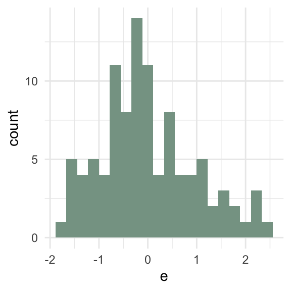
\(\sum e_i\) = 0
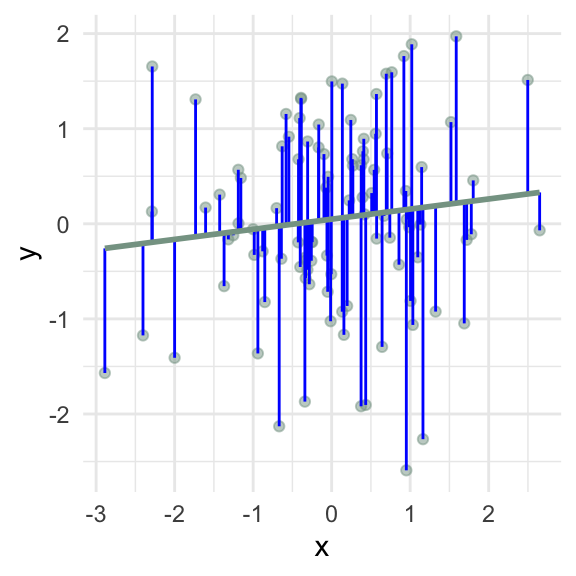
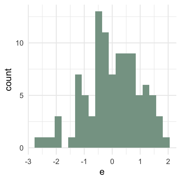
\(\sum e_i\) = 0
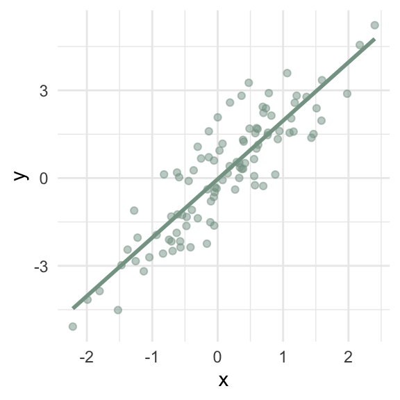
d4 <- tibble(x = rnorm(100),
             y = 2 * x + x / 2 * rnorm(100, sd = 10))
m4 <- lm(y ~ x, data = d4)
d4 <- d4 %>%
  mutate(y_hat = fitted(m4),
         e = residuals(m4))
ggplot(d4, aes(x = y_hat, y = e)) +
  geom_point(color = "#86a293") +
  geom_hline(yintercept = 0, color = "#86a293") +
  labs(x = "Fitted value",
       y = "Residual")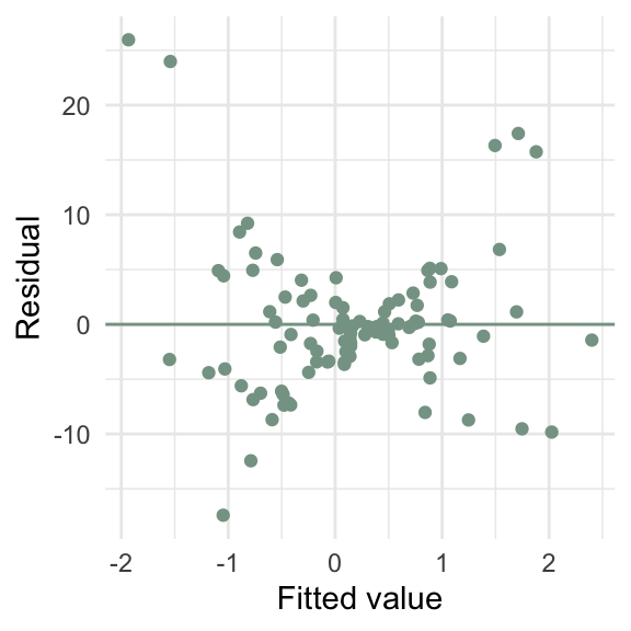
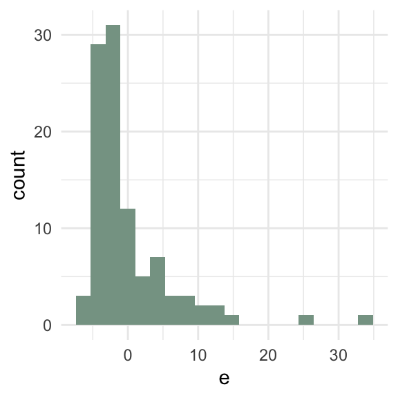
d5 <- tibble(x = runif(100, max = 10),
             y = x * rnorm(100, sd = 10))
m5 <- lm(y ~ x, data = d5)
d5 <- d5 %>%
  mutate(y_hat = fitted(m5),
         e = residuals(m5))
ggplot(d5, aes(x = y_hat, y = e)) +
  geom_point(color = "#86a293") +
  geom_hline(yintercept = 0, color = "#86a293") +
  labs(x = "Fitted value",
       y = "Residual")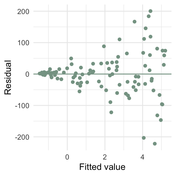
full_magnolia_data %>%
  nest_by(id) %>%
  mutate(mod = list(lm(leaf_length ~ leaf_width, data = data))) %>%
  summarise(broom::tidy(mod, conf.int = TRUE)) %>%
  filter(term == "leaf_width") %>%
  ggplot() +
  geom_segment(aes(
    x = conf.low,
    xend = conf.high,
    y = id,
    yend = id,
    color = id == 3
  )) +
  geom_vline(xintercept = coef(lm(leaf_length ~ leaf_width, full_magnolia_data))[2], lty = 2) +
  scale_x_continuous(limits = c(-2, 4)) +
  scale_color_manual(values = c("black", "cornflower blue")) +
  labs(x = "Relationship between leaf length and leaf width (Slope)",
       y = "Student") +
theme(legend.position = "none")full_magnolia_data %>%
nest_by(id) %>%
mutate(mod = list(lm(leaf_length ~ leaf_width, data = data))) %>%
summarise(broom::tidy(mod, conf.int = TRUE)) %>%
filter(term == "leaf_width") %>%
ggplot() +
geom_segment(aes(
x = conf.low,
xend = conf.high,
y = id,
yend = id,
color = id == 3
)) +
geom_vline(xintercept = coef(lm(leaf_length ~ leaf_width, full_magnolia_data))[2], lty = 2) +
scale_x_continuous(limits = c(-2, 4)) +
scale_color_manual(values = c("black", "cornflower blue")) +
labs(x = "Relationship between leaf length and leaf width (Slope)",
y = "Student") +
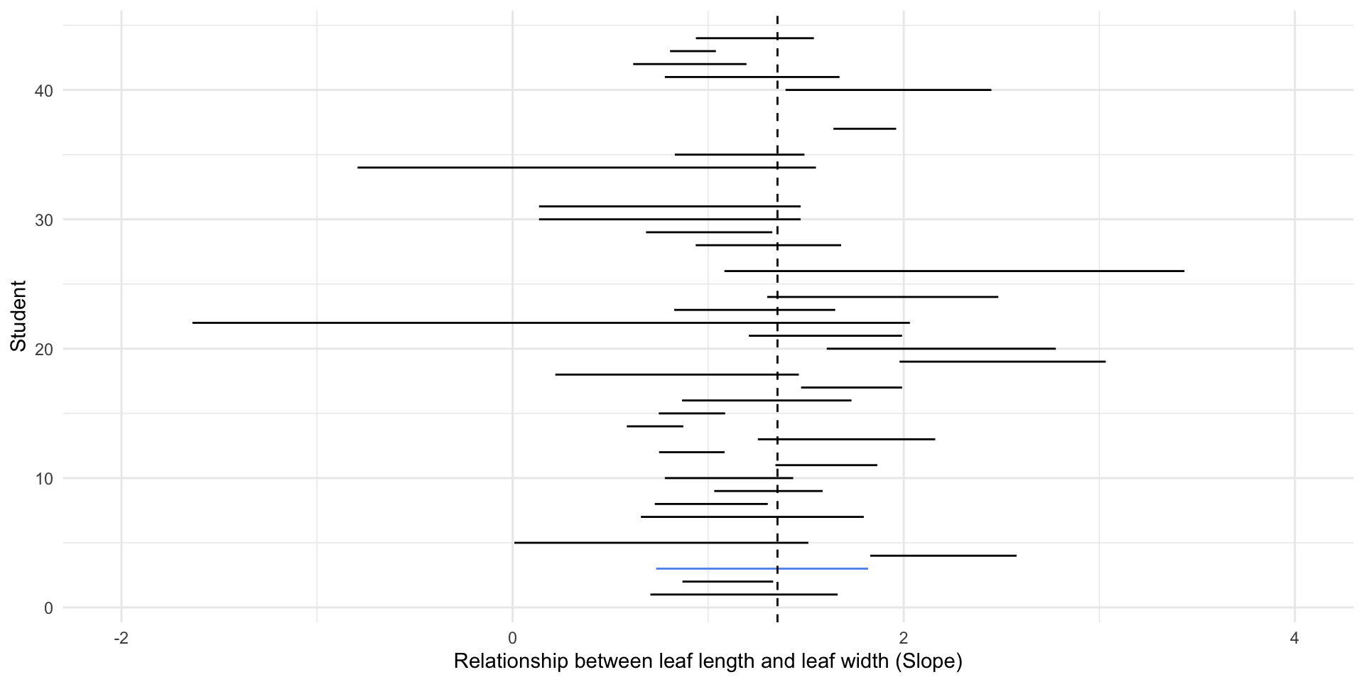
theme(legend.position = "none")Are these independent?
full_magnolia_data %>%
nest_by(id) %>%
mutate(mod = list(lm(leaf_length ~ leaf_width, data = data))) %>%
summarise(broom::tidy(mod, conf.int = TRUE)) %>%
filter(term == "leaf_width") %>%
ggplot() +
geom_segment(aes(
x = conf.low,
xend = conf.high,
y = id,
yend = id,
color = id == 3
)) +
scale_x_continuous(limits = c(-2, 4)) +
geom_vline(xintercept = coef(lm(leaf_length ~ leaf_width, full_magnolia_data))[2],
lty = 2) +
scale_color_manual(values = c("black", "cornflower blue")) +
labs(x = "Relationship between leaf length and leaf width (Slope)",
y = "Student") +
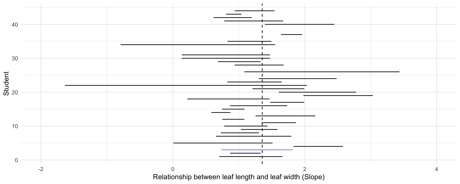
theme(legend.position = "none")Was the sample random?
full_magnolia_data %>%
nest_by(random_id) %>%
mutate(mod = list(lm(leaf_length ~ leaf_width, data = data))) %>%
summarise(broom::tidy(mod, conf.int = TRUE)) %>%
filter(term == "leaf_width") %>%
ggplot() +
geom_segment(aes(
x = conf.low,
xend = conf.high,
y = random_id,
yend = random_id,
color = random_id == 3
)) +
geom_vline(xintercept = coef(lm(leaf_length ~ leaf_width, full_magnolia_data))[2], lty = 2) +
scale_x_continuous(limits = c(-2, 4)) +
scale_color_manual(values = c("black", "cornflower blue")) +
labs(x = "Relationship between leaf length and leaf width (Slope)",
y = "Student") +
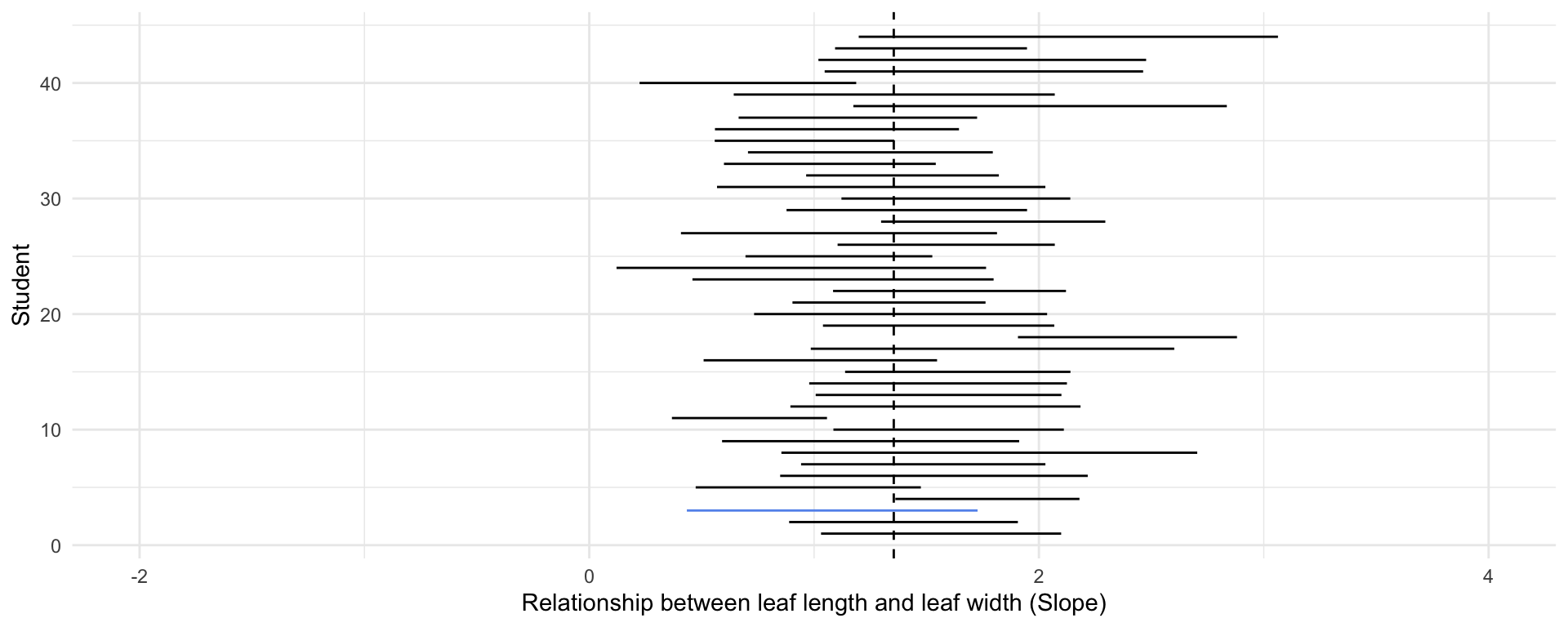
theme(legend.position = "none")