08:00
Final Project
Lucy D’Agostino McGowan
The data
- Data was obtained from IPEDS
- Includes:
- US 4 year public or not-for-profit private institions that are degree-granting, primarily baccalaureate or above with between 1,000-9,999 students (N = 1,002)
- 157 observations were dropped due to missing data, leaving N = 845 observations in the final data set
Application Exercise
- Copy the following template into RStudio Pro:
Open the file labeled
data-exploration.qmdRead in the data set into an object called
datExamine the data, how many observations are there? How many variables? Add the description to your file.
Examine the data dictionary by opening the file called
data-dictionary.csvFind the outcome variable (the retention rate) and your variable of interest specific to your group. Create a plot to visualize the relationship between these variables. Add a description to your file
Does the data look like it needs a transformation? If so, apply one and examine the plot again. Describe this in your file.
Examine the distribution of the other variables
We can build a table to examine the distribution of our variables.
| Characteristic | N = 321 |
|---|---|
| mpg | 19.2 (15.4, 22.8) |
| cyl | |
| 4 | 11 (34%) |
| 6 | 7 (22%) |
| 8 | 14 (44%) |
| disp | 196 (121, 326) |
| hp | 123 (96, 180) |
| drat | 3.70 (3.08, 3.92) |
| wt | 3.33 (2.58, 3.61) |
| qsec | 17.71 (16.89, 18.90) |
| vs | 14 (44%) |
| am | 13 (41%) |
| gear | |
| 3 | 15 (47%) |
| 4 | 12 (38%) |
| 5 | 5 (16%) |
| carb | |
| 1 | 7 (22%) |
| 2 | 10 (31%) |
| 3 | 3 (9.4%) |
| 4 | 10 (31%) |
| 6 | 1 (3.1%) |
| 8 | 1 (3.1%) |
| 1 Median (IQR); n (%) | |
Application Exercise
- In the Console in RStudio Pro run:
- Edit the code in the
table-onechunk to examine a Table of your variables. Move your variable of interest to the top of the list so that it is the first rendered in the table.
03:00
Building your causal framework
The ggdag package can help us display our causal assumptions you drew last week. There are three steps:
- Write out the models (like the ones you are submitting in homework 2) in a function called
dagify - Pass this to the
ggdagfunction to plot them - Pass this to the
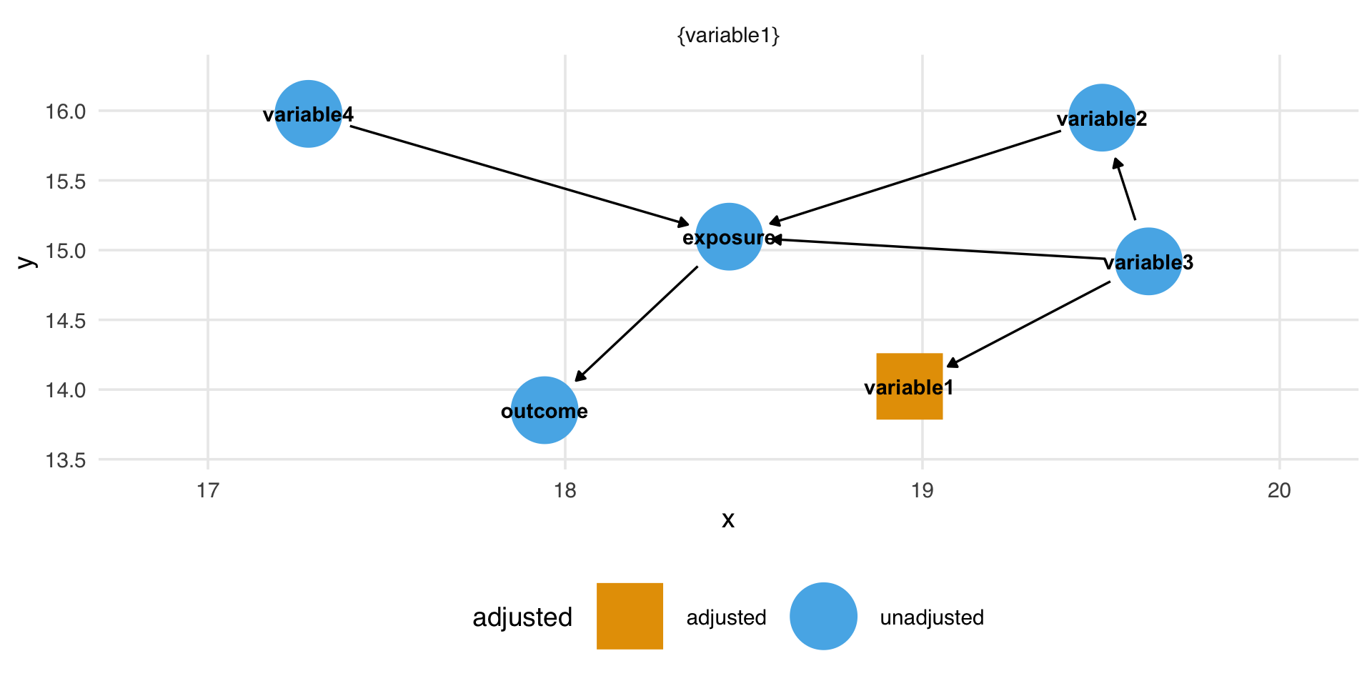
ggdag_adjustment_setfunction to determine what you need to add to your final model.
ggdag
ggdag
library(ggdag)

dag <- dagify(
  exposure ~ variable1 + variable2 + variable3 + variable4,
  outcome ~ exposure + variable1,
  variable1 ~ variable3,
  variable2 ~ variable3,
  exposure = "exposure",
  outcome = "outcome",
  latent = "variable3",
  labels = c(variable1 = "Variable 1",
             variable2 = "Variable 2",
             variable3 = "Variable 3",
             variable4 = "Variable 4",
             exposure = "Exposure",
             outcome = "Outcome")
)
ggdag
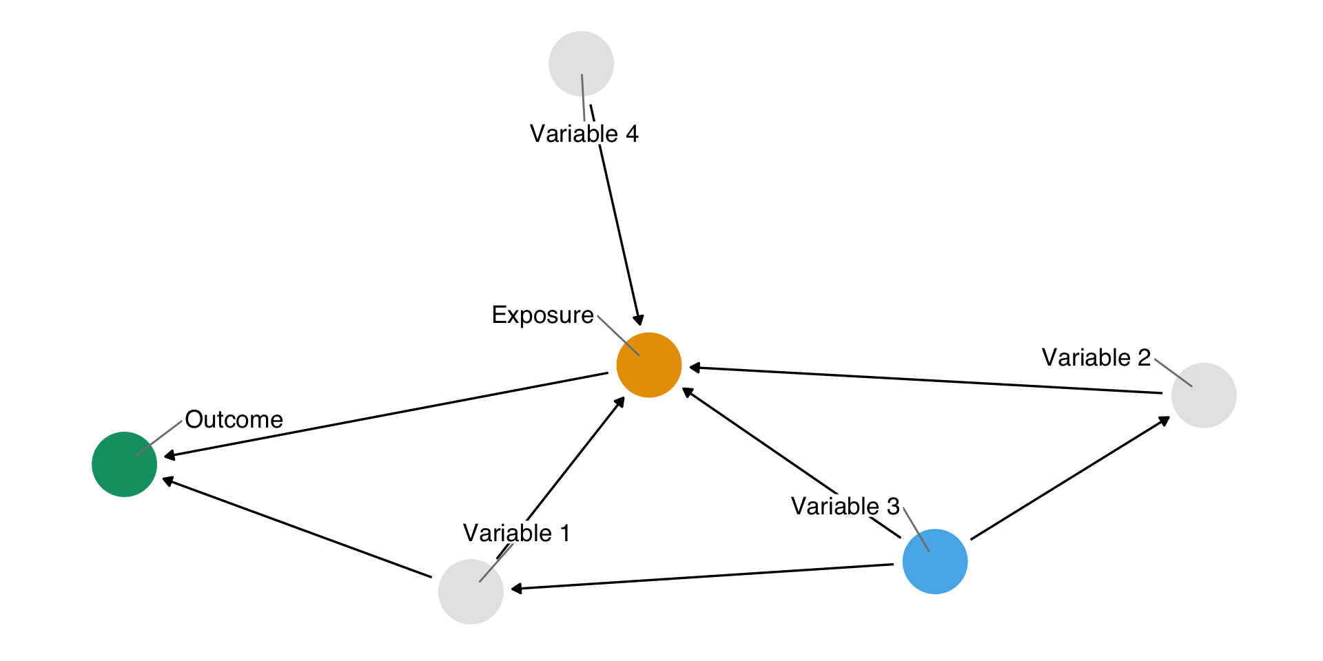
ggdag
Final model
🎉
Application Exercise
- Open the
data-dictionary.csvfile and map the available variables to the names in the equations you developed for homework 2. - Rewrite the formulas using these equations; if something is not available in this dataset, you can make up a variable name for it
- Open
causal-assumptions.qmd - Add your equations to the
dagifycode chunk after deleting the# add your equations herecomment. Make sure to separate each equation with a comma - Update the “exposure” with your variable of interest
- Run the
ggdagchunk to create the causal diagram - Run the
adjustment_setchunk to see what variables you need to adjust for - Write out your final model based on this adjustment set
20:00
Loose ends
- Click the blue, down arrow in the
GitPanel on the top right to pull in new data. Raise your hand if this doesn’t work. - Open
data-exploration.qmdRender the document. Do you see a figure of your variable on the x-axis and the outcome on the y-axis? If not, create that figure and re-render the document - Is all of the example text “filled in” in
data-exploration.qmd? If not, fill it in. - Open
causal-assumptions.qmdRender the document. Do you see two figures, one with the Causal Diagram and one showing the adjustment set? If not, be sure that you have seteval: truein all of the chunks Note: if you are getting an error, raise your hand so I can come help out
05:00
Application Exercise
- Open
data-dictionary.csvand examine the available variables. Are there any that you didn’t include in your causal diagram that maybe should be included? Add them now - Pair up with another group and present your causal diagram. Exchange thoughts on what other variables might be important to include. Add them now
Pairs:
- student services – endowment
- percent admitted – total cost
- student/faculty ratio – average instructor salary
- Re-render your
causal-assumptions.qmdfile with these changes and observe your final adjustment set.
20:00
Putting it all together
- Ultimately, we are interested in the effect of changing your variable of interest on first-year retention rates.
- After fitting your final model, extract the coefficient and confidence interval for this effect. Consider adjusting the effect to be on a “useful” scale (for example rather than dollars, perhaps $1,000 is easier to interpret)
- Based on the evidence presented decide whether you think Wake Forest should invest in changing your variable of interest in order to increase first-year retention
- Report a predicted change in retention based on a change in your variable for a school with Wake Forest’s same characteristics
Application Exercise
- Open
final-model.qmd - Fit your final model – be sure to use any transformations that you determined in your first step and include all variables determined necessary by your “adjustment set” analysis
- Check the assumptions for linear regression – were they met?
- Extract the coefficient and 95% confidence interval for your effect of interest – is this significantly related to first-year retention?
- Give a one sentence recommendation to Wake Forest based on what you have found.
20:00
Application Exercise
- Open the
sensitivity-data.qmdfile. This is a sensitivity analysis for including athletic data and US News Ranking data - Read in the
athletics_dat. How many observations are there? Fill in the explanation with this number. - Refit your “final model” adding in the
bball_power_rating. Does this change your result? Add an explanation of what you see. - Read in the
usnews_dat. How many observations are there? Fill in the explanation with this number. - Refit your “final model” adding in the
usnews_ranking. Does this change your result? Add an explanation of what you see.
10:00
Application Exercise
Let’s put this all together!
- Open
index.qmd - Write one or two sentences describing your recommendation to Wake Forest University based on your findings. This can include information from your sensitivity analysis.
- Render the document. Click on all of the links on the top, make sure they are rendered as well.
10:00